
Fedrigoni 16/2
Editorial Design
+
Thinking
16/2 publication features the original work of eight international designers in a 16-page section using Fedrigoni papers and print embellishments. Our section Te Whenua uses the tradition of story-telling to convey the very essence (te ihi) of who we are and ignite a spirit of Aotearoa-ness as we introduce an international audience to our cultural heritage.
Hand in hand, our journey shares the richness of te reo through the sequence of powerful images of whenua and taonga, which are bookended by an explanatory index. This journey places us in our unique geographical location and pays homage to the Māori myths and legends that speak to the heart of our history and people ‒ our response to a brief requiring each design studio to express the creative identity of their country and surrounding cultural stimuli.
Concept
To stay true to ourselves and our culture, we used design to communicate the essence (te ihi) of who we are. With this in mind, we began this journey with a karanga “Nau mai ki te ao o te ramaaroa. Tihewa mauri ora”, which sets the tone and invites our audience in.
It shares the richness of te reo and we look to the heavens and the gifts shared with us from the atua. Our connection to our beautiful whenua, its mountains, rivers, fauna and taonga, inspired us to look at some of the myths and the practical and spiritual associations surrounding our choice of design direction.
Our creative approach was always going to be collaborative, it’s how we work. We crossed countries and embraced generations to share knowledge and develop an expression of our culture that stays true to this Māori and non-Māori collaboration.
The treatment of photography, illustration and type accentuate the richness of our connection to Aotearoa and our typeface Plateau complements the geographical formations represented by sky, land, rivers and mountains.
Execution
This 16-page section highlights our vision by employing modern graphics to reawaken and share traditional stories that celebrate our unique cultural heritage and honour paper and print methods in book design.
Special print embellishments and processes such as silk-screen varnish activate the macro porous surface of Tintoretto Gesso stock to showcase the significance of story, myth and spirit ‒ pounamu, kōwhai flower, huia feather and bone necklace.
Printed in full CMYK, PMS 808 and PMS 810 inks, this fibrous medium acts as a natural foundation for our content and craft.


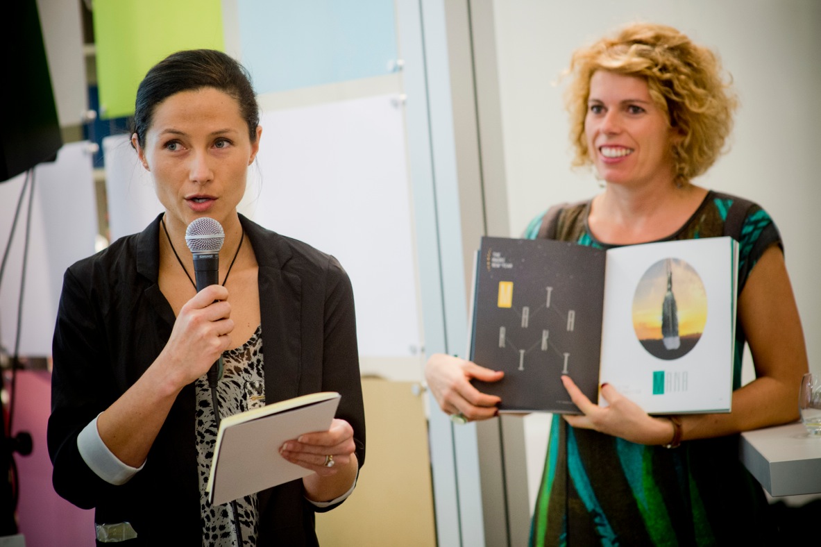
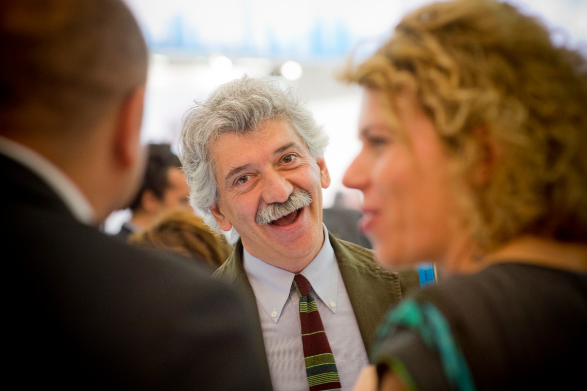
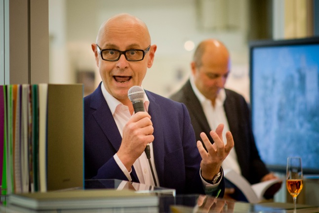
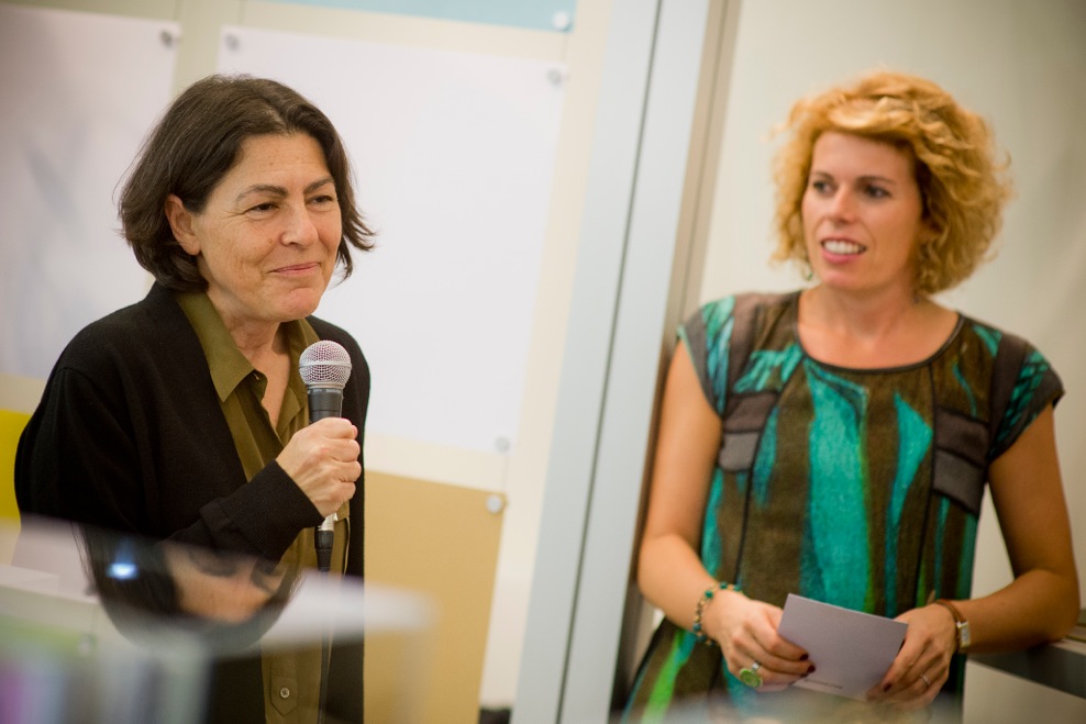
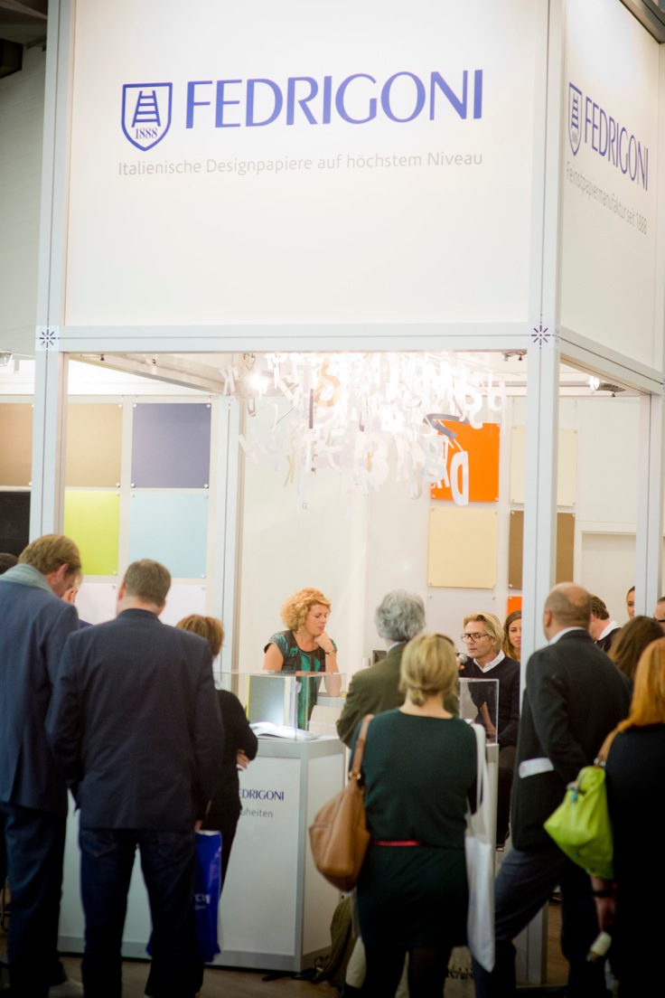
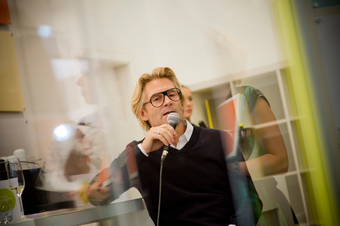
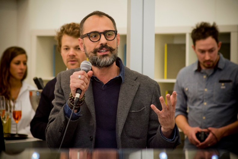
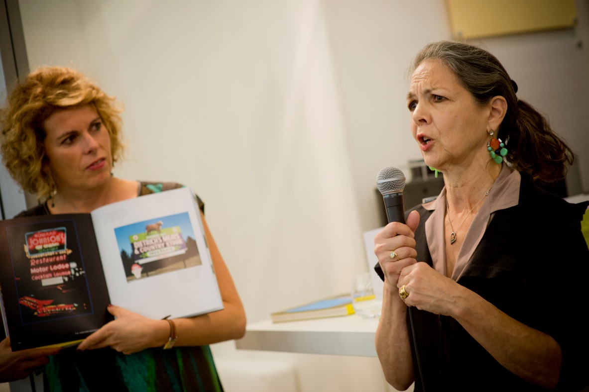
Images from the launch of 16/2 at frankfurt bookfair, Germany

Client
Fedrigoni
Design / Copy Writing
Threaded Media Limited
Typography
Plateau - Designed in-house by Nick Baillie
Photography
Brandon Littlefield
3D Graphics
Han Law
Introduction Copy
Te Raa Nehua
Other Contributors:
Karyn Gibbons